The platform
Collective Goods runs pop-up retail events in organizations nationwide. Workplaces, schools, and community groups host on-site shopping events where employees and members can browse and buy products, with a portion of proceeds benefiting their organization. The model is part retail, part fundraising, and the product experience has to serve both purposes without muddying either.
I joined as a contract UX/UI Designer in 2015 and was promoted to Senior Digital Experience Designer in 2016. During that time I designed all three surfaces, including the marketing website, the consumer mobile app, and the admin portal used by sales reps to manage inventory and sales at each location, and built the marketing website's front end directly to production. The admin portal and mobile app were delivered as prototyped front-end code for the engineering team to integrate.
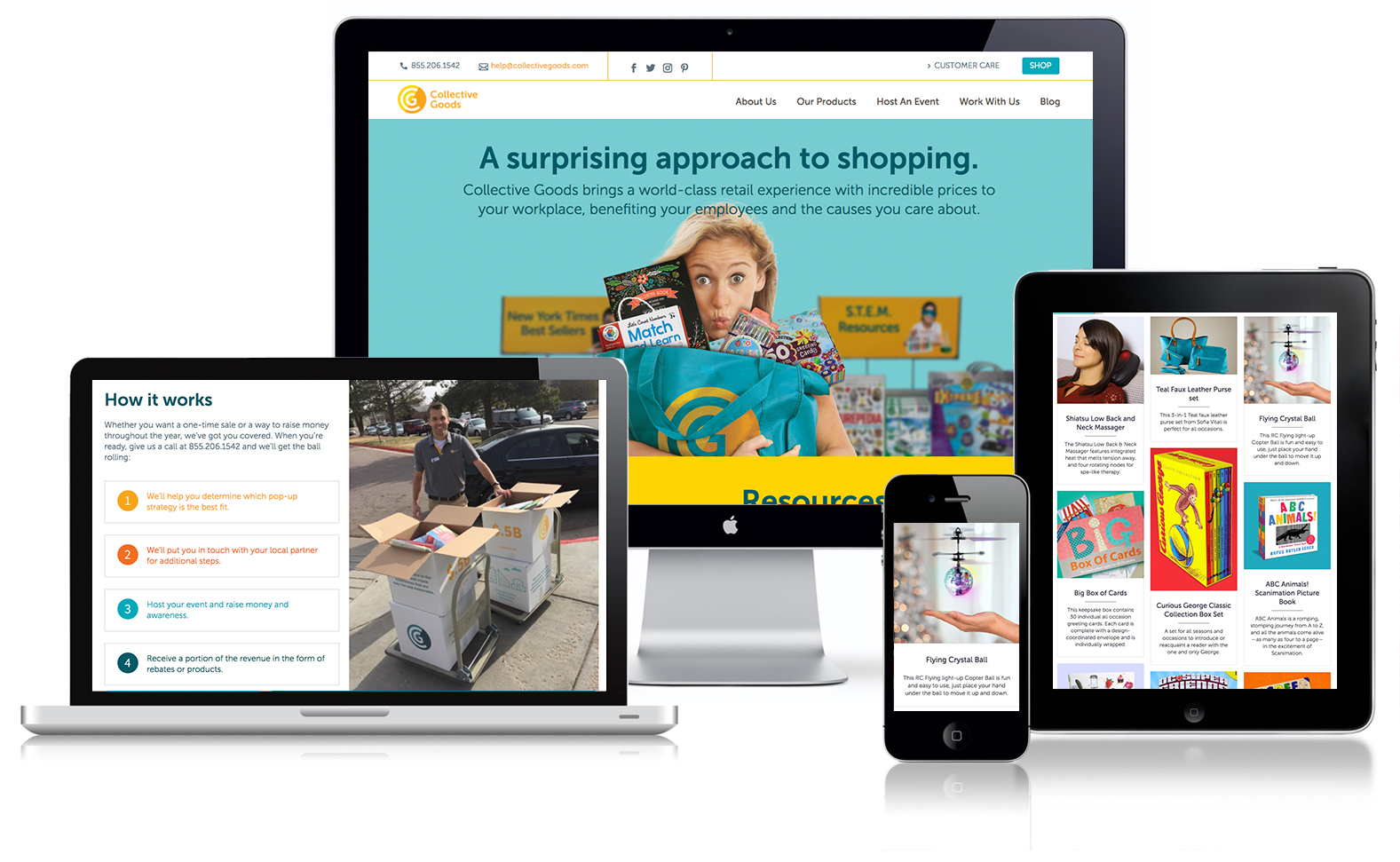
The website
I designed and built the responsive front end for the marketing website, covering event discovery, how it works, and partner information. It served two audiences: buyers learning about Collective Goods and finding events near them, and organizations considering hosting a pop-up.
The admin portal
I designed the admin portal to work in tandem with the mobile app, ensuring sales reps and consumers operated from the same underlying data while each experience remained optimized for its specific context. It gave Collective Goods sales reps the tools to manage each pop-up location: inventory levels, order status, and sales tracking across active events.
This meant utility-first. Clarity and speed mattered more than brand expression. It was a different design problem than the consumer app, even though the underlying information was shared.
The mobile app
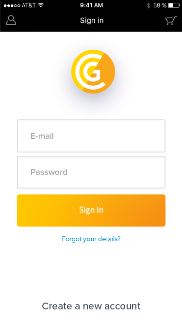
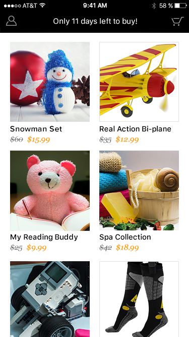
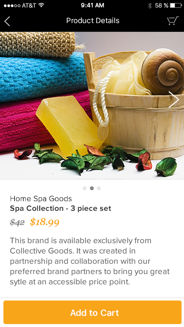
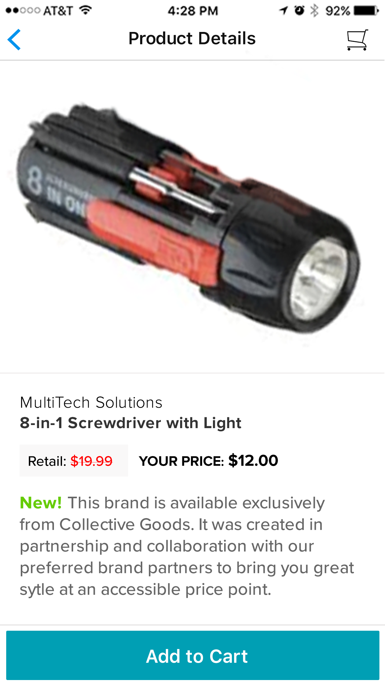
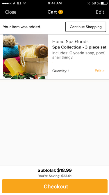
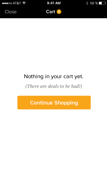
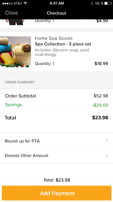
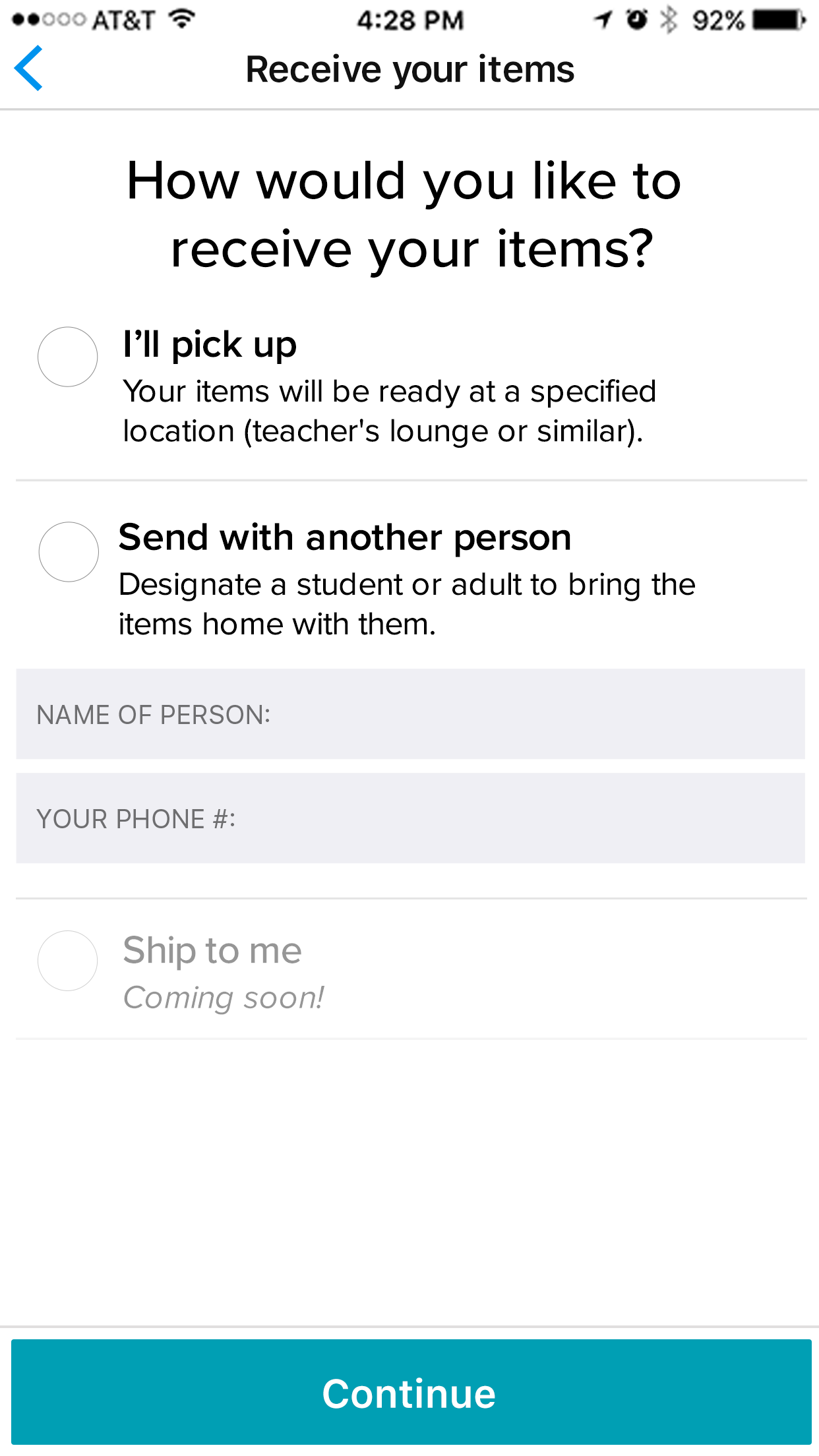
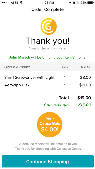
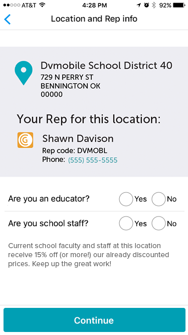
I designed the mobile app, working through the full system rather than any individual screen: making sure decisions made in catalog browsing didn't create problems at checkout, that pricing complexity was surfaced clearly without overwhelming first-time buyers, and that the confirmation state felt like a completion rather than simply a receipt.
The pop-up context added layers to a shared flow: location awareness, event timing, and a pricing model that varied by buyer type.
The app served two modes of use: pre-ordering products ahead of a pop-up event at a nearby location, and standard e-commerce for buyers not attending an event in person. Both paths ran through the same product catalog and checkout flow.

Customer experience research
The design work was informed by a customer experience journey map that modeled the full buyer experience, not just the transaction itself. Looking beyond individual screens helped reveal where confusion emerged, where expectations diverged from reality, and where the experience needed additional support.